

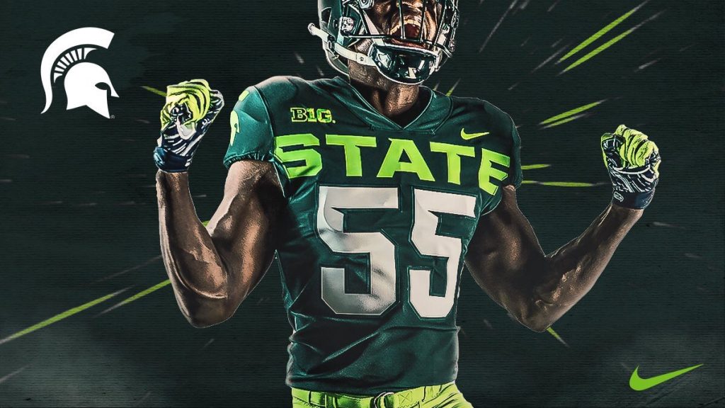
Saturday Michigan State Football unveiled new alternate uniforms for the 2019 season and my god they suck.
Adding neon green with a big “State” across the chest just looks gross and something we’ll probably see coming with the new XFL that’ll last all of four months. Or a mid major program that needs to utilize their aesthetic look in an effort to attract new recruits.
Not that I’m against any kind of tweak to the current kits. In fact the third uni should be reserved to have little fun with. But what connection to these have with the program or the Spartan namesake?
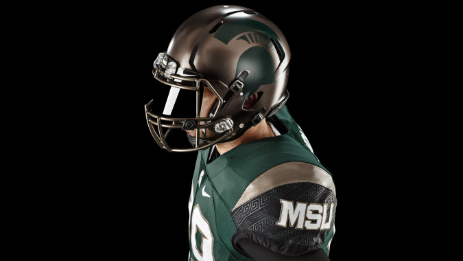
MSU was on the right track with the bronze pro combat’s a few years ago. How about we improve on those?


